Saas Product UX/UI Redesign
The Goal: Imagine and design a new UX/UI for an app or website that I use often and would like to see improved.
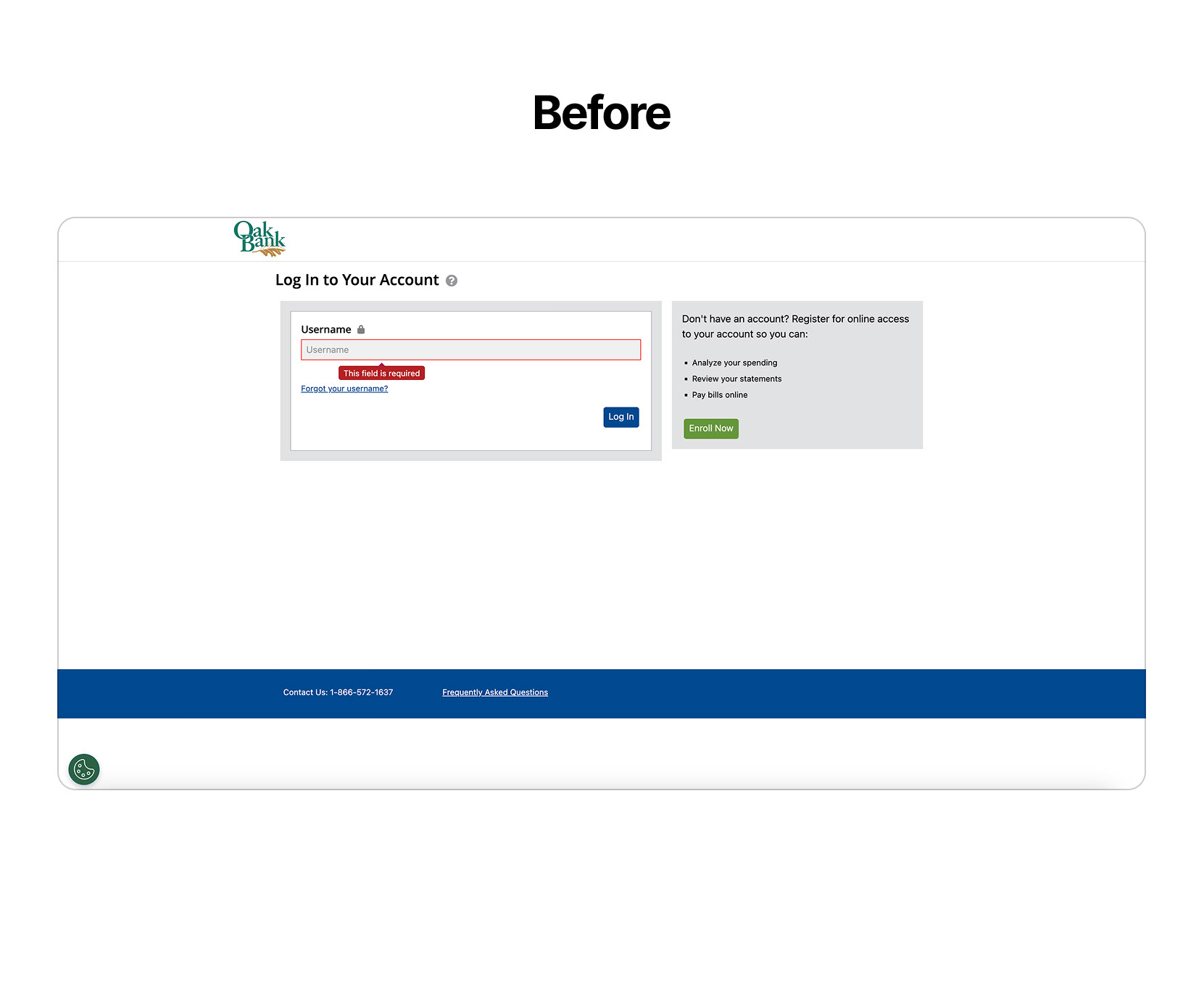
The Client: MyCardStatement.com is a web app that many banks use to check credit card statements and make payments.
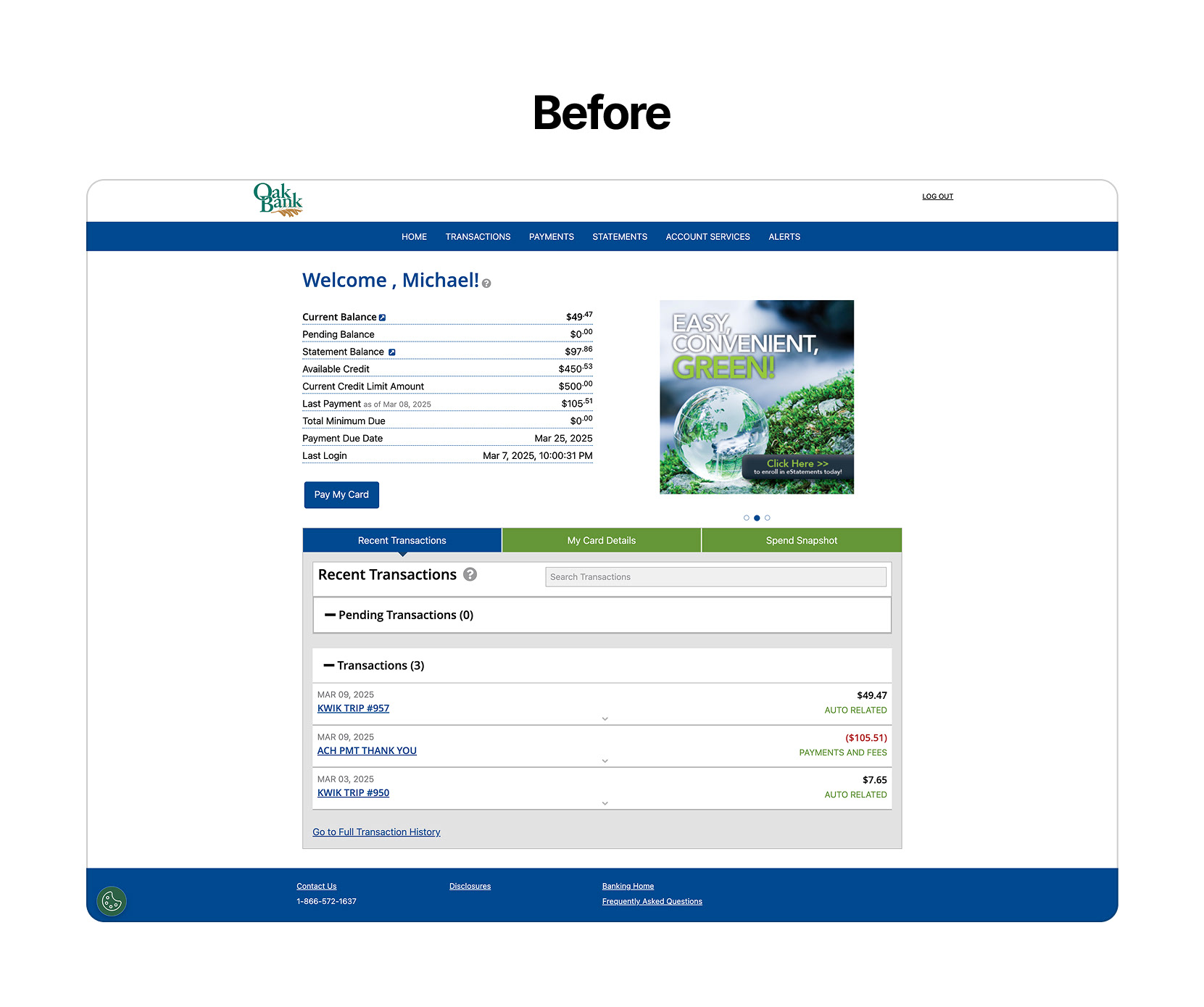
The Problem: As with many banking web services, this site looks dated and can be confusing to use, both for new and returning users. The layout feels dry and can be hard to navigate.
The Solution: Use a Design System in Figma to create a fresh, intuitive UI and user experience.
UX Issues & Solutions
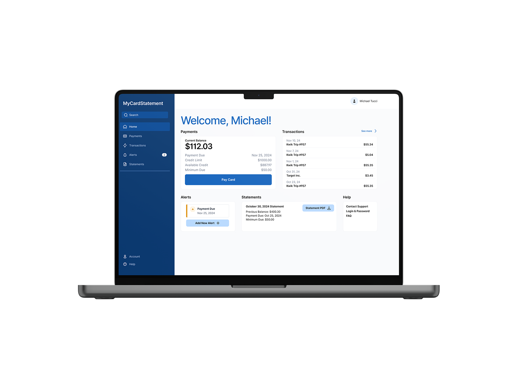
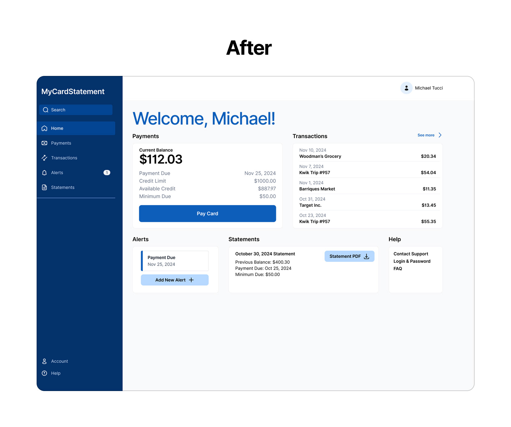
This site is used to check credit card balances and pay them. On the original site, the credit balance number lacks visual hierarchy and blends in with other data, and the button to pay the card is small, which leads to users struggling to find it quickly.
To improve the site's user experience, the Current Balance number was given greater hierarchy, and the Pay Card button was made much more prominent than other options.
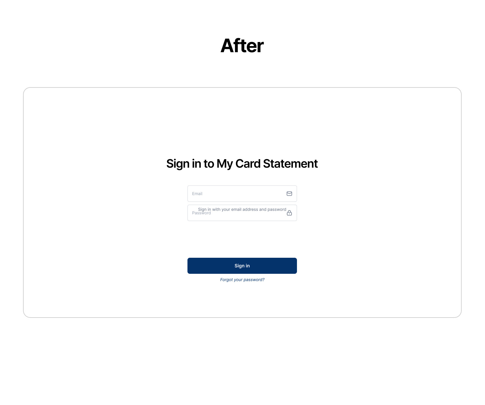
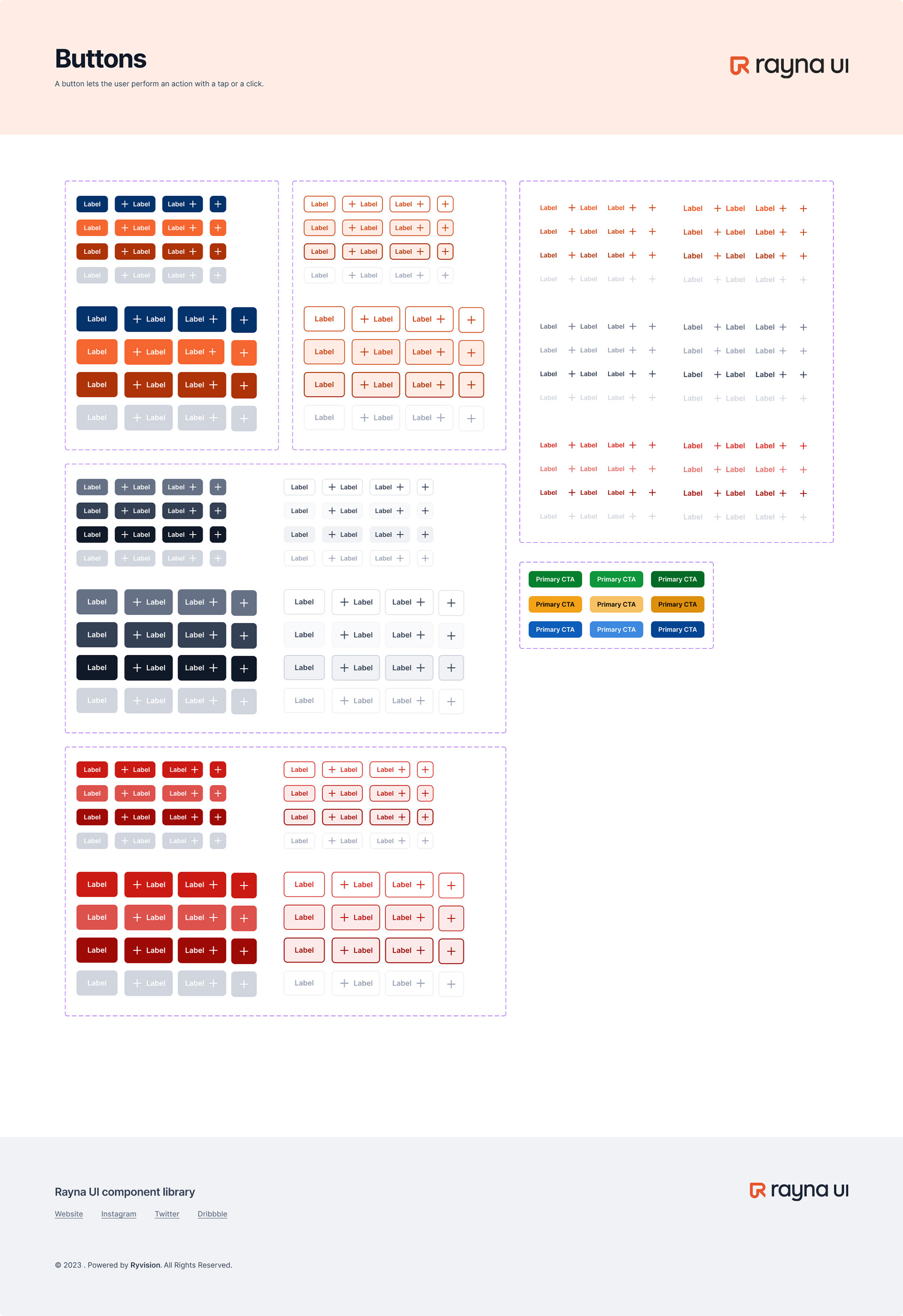
The Design System
A design system called Rayna UI was used in Figma to redesign this site. I used Rayna components, icons, and typography presets to build out the interface. Almost every element on each page comes from the Rayna system, from the headings and navigation section to the icons and shape dividers. After using Rayna to build the layout, the existing MyCardStatement brand colors were used to style the design.
By using a prebuilt design system, I was able to streamline my design process by spending more time on the layouts and UX rather than creating a new design system from scratch.