Nonprofit Website Redesign
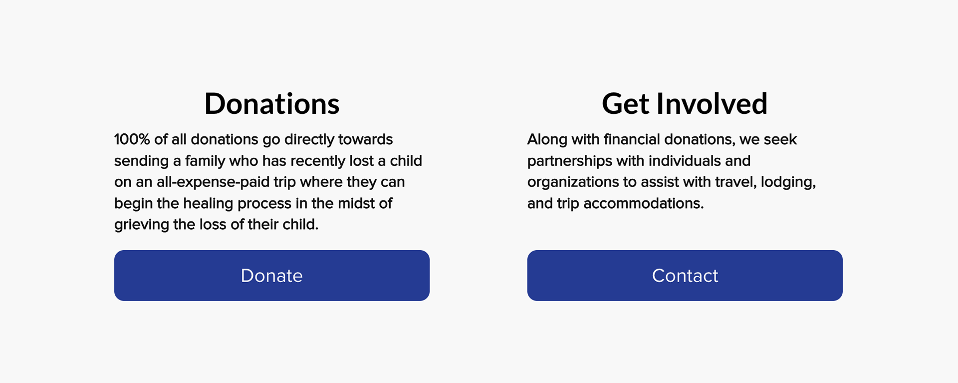
The Client: Nevaeh's Rae of Hope is a local nonprofit organization that seeks to bring hope and healing to families who have recently experienced the loss of a child. Their mission is to support families through their journey of grief by providing a restorative, all-expense-paid getaway.
My Role: Visual & UX design
The Problem: The current website lacks visual aesthetic, organization, and structure.
The Goal: Refresh the current visuals, layout, & UX.
Check out the live website here:
Personas
To help with the UX redesign process, I created two personas. I used ChatGPT to help me brainstorm ideas, and then I edited the results to fit the project.
Persona 1
Sara and her husband lost their 3-year-old daughter to a rare illness 6 months ago. They still feel overwhelmed and are emotionally and mentally exhausted. Taking time to plan a vacation would be stressful, but it would help to have that time to rest.
Sara doesn’t like cold, sterile websites or long applications.
Sara doesn’t like cold, sterile websites or long applications.
Persona 2
Anthony is a real estate investor looking for nonprofit organizations to donate to. He heard about Nevaeh’s Rae of Hope from a friend, and he will go to the website to learn more and donate if he finds it interesting.
He likes when organizations have a clear mission statement, and he cares deeply for people who are grieving.
He likes when organizations have a clear mission statement, and he cares deeply for people who are grieving.
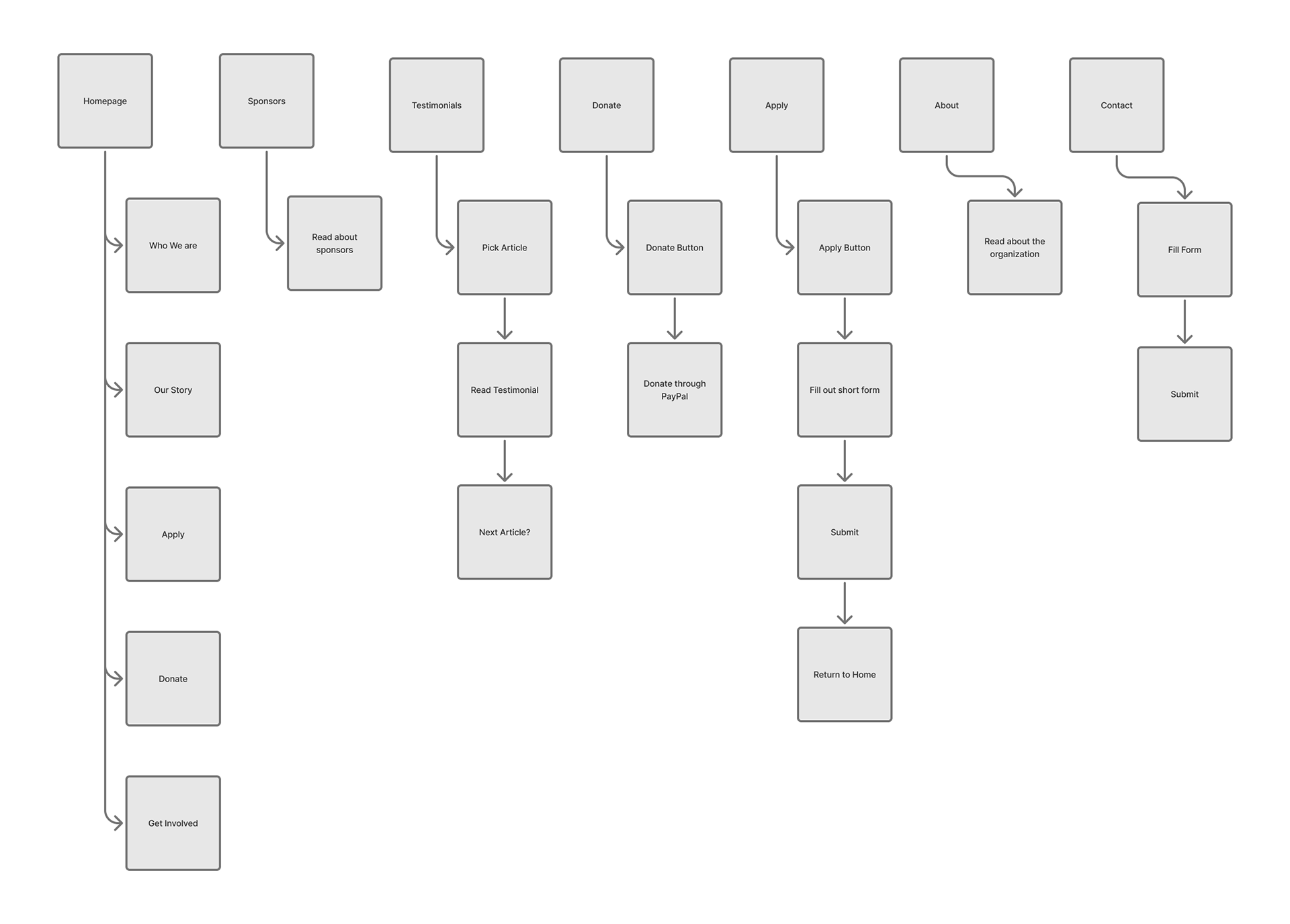
Sitemap
All of the current site features and elements were arranged into a sitemap.
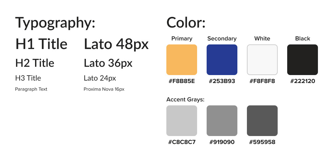
Style Guide
A simple style guide was created to aid the design process of the website. The colors and typography were chosen to help the site feel professional, calm, and friendly.
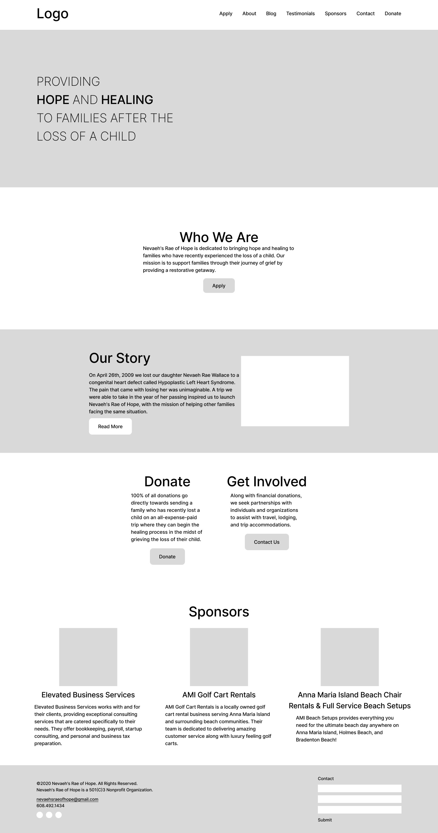
Wireframes & Styling
The next step in the process was creating some lo-fi wireframes. After the lo-fi wireframes were built, the website's layout was built in Wix, then color, typography, and images were added according to the style guide.

UX Notes
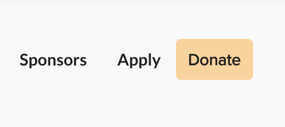
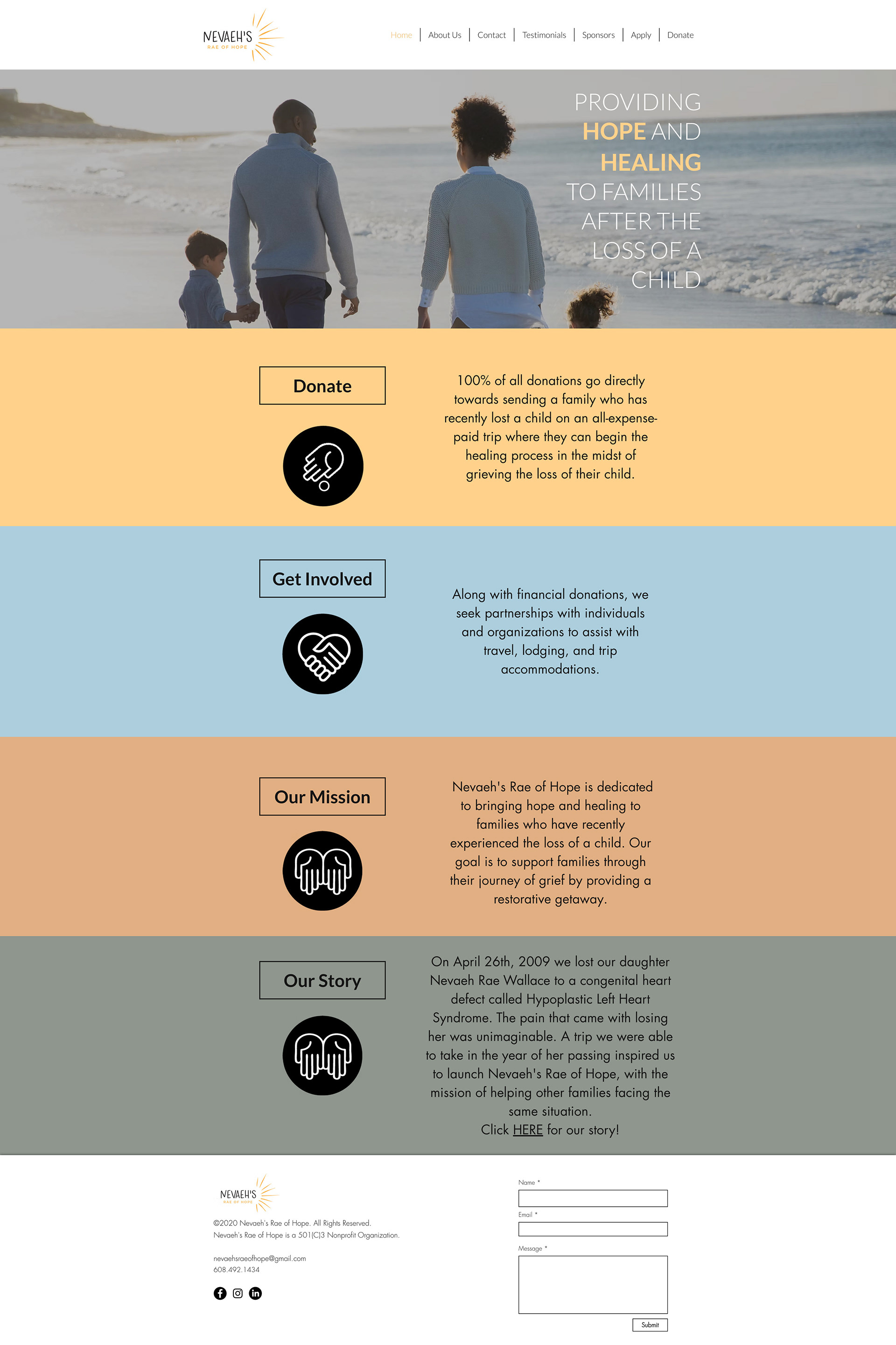
During my UX research process, I found out that most of the traffic on the site comes from potential donors, with only a small number of people looking to apply for trips regularly.
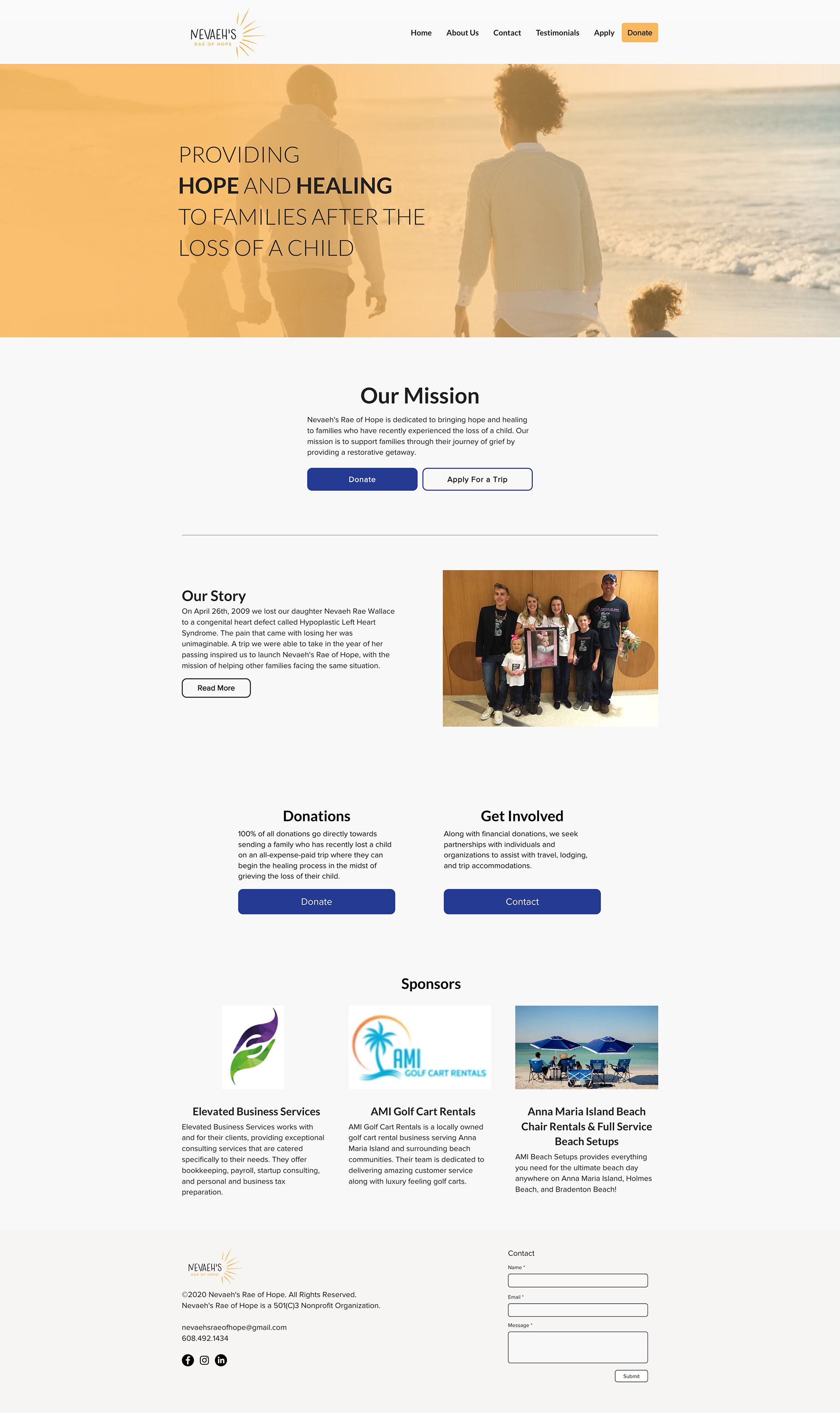
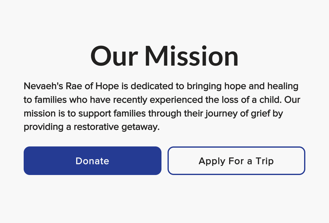
To improve the user experience for people looking to donate to the organization, I chose to put more emphasis on the donate buttons on the homepage. I highlighted the donate button in the nav bar and gave the donate button more hierarchy under the mission statement by using a color-filled button that created more contrast.
Before & after redesign
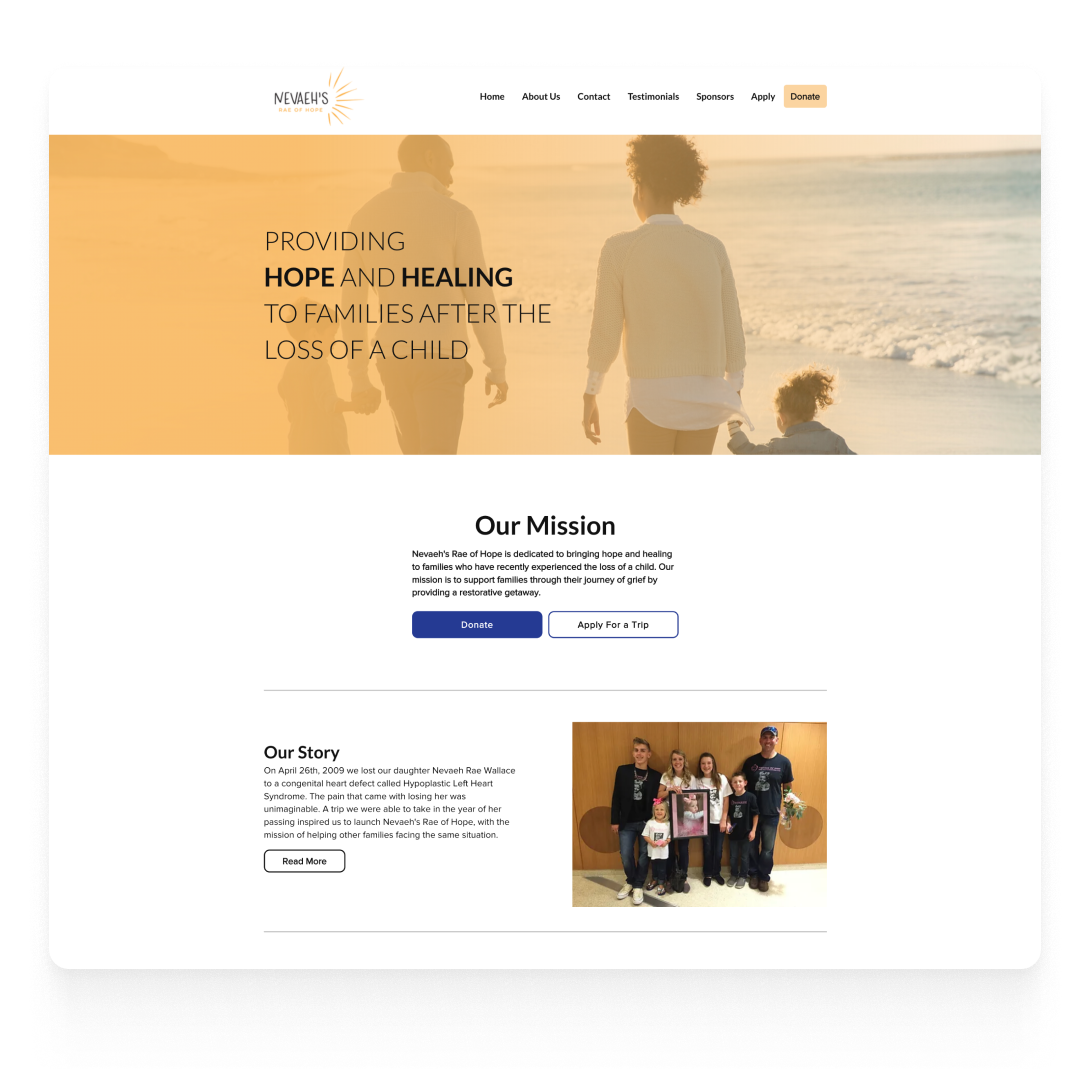
Original site